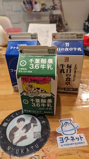
Japanese milk cartons feature a unique design element specifically for assisting visually impaired or blind individuals. Here’s what it’s about:
On the top of many Japanese milk cartons, there’s a small arc-shaped cut or indentation. This design was introduced around 2001 following a survey by Japan’s Ministry of Agriculture, Forestry, and Fisheries. The survey revealed that visually impaired people found it challenging to differentiate milk from other beverages due to similar packaging.
The notch helps blind or visually impaired individuals to identify that the carton contains 100% milk. This allows them to distinguish it from other beverages like flavored milks and fruit juices, which do not have this feature.
The indentation is placed opposite to where the carton opens, helping them locate the opening side without needing to see.
Not all manufacturers implement this design, but where it exists, it’s consistent across cartons of 500ml or more.
Visually impaired and blind people were often frustrated with drink cartons: they couldn't tell which was which. Since 2001 all Japanese milk cartons of 500ml or larger size has a notch on top, opposite of the opening side. All other drink types do not have a notch. pic.twitter.com/wqANTWLVul
— Wrath Of Gnon (@wrathofgnon) November 13, 2024
