By Guest Author Meir Barak*
The Japanese candlestick method is retro and amazing, and started in…the 18th century! The method was developed by Munehisa Homma, a Japanese rice trader (1724-1803) who was one of the first to make use of past rice prices to predict future prices. And the method really worked! Munehisa became very wealthy from the rice trade, and was bestowed the title of “Honorary Samurai.” Someone calculated his annual trading profits in modern terms and reached the figure of $10 billion, with a cumulative capital of $100 billion!
The principles of this method were studied in the 1970s by several technical analysts, and primarily by Steve Nison, who also wrote a bestseller on the method. The result being that the Japanese candlestick method serves us well today.
Munehisa Homma’s method allows me to understand the changing prices across an axis of time. Note that I used the word “understand” rather than merely “observe” or “see.” Over the years, I experienced an amazing phenomenon. If you, like me, spend several years observing the Japanese candlestick method, perhaps you too will undergo a similar transformation. At some point, though I cannot define exactly when it happened…I managed to comprehend the candle “matrix.”
Reading a Candlestick Chart Lets me Speak Japanese
Now when I look at a complex Japanese candlestick chart, I start talking fluent Japanese. I “understand” the stock without needing to analyze the chart. I can look at it just as a surgeon looks at a brain scan, or as a musician hears music when he or she sees notes. I am in the world of support, resistance, breakouts and breakdowns, and bears and bulls. This virtual world of rising and falling prices is where some of them “respond,” too: “Buy me, sell me… I’m willing to keep rising up to the price of…”
You’re probably thinking that after so many years of Japanese candlesticks, I’ve lost my mind. There could be a bit of truth to that. But for those of you who know how to play a musical instrument and who succeeded (unlike me, who was forced to learn piano and is left with nothing to show for it but “Do Re Mi”) in moving from just reading the notes to hearing them, you know exactly what I mean. For a musician, this is the stage in which he or she lives within the “body” of the notes. For the stock trader, it is the stage in which he or she feels the stock, senses the fear and greed of sellers and buyers, and knows how to take advantage of this for his or her own benefit. As a novice trader, I needed some ten minutes to analyze a chart comprised of Japanese candlesticks. Now that takes me no more than several seconds.
Below is a typical Japanese candlestick chart showing daily price changes over a period of sixteen trading days. Each candlestick represents one day of trade. Does the chart look familiar? That’s because it provides the same information as the bar chart from a couple of pages back. At first glance, it appears a little more complicated, but as I explained above, I promise it’ll get easier.
16-Day AAPL Japanese Candlestick Chart
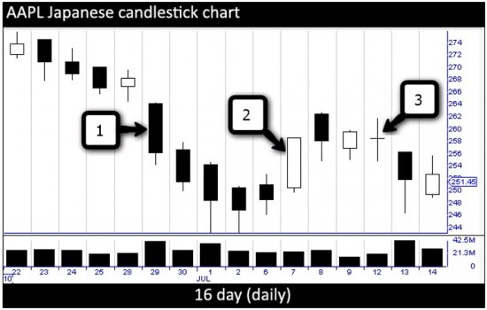
Here, too, each candlestick represents one day of trade: [1] a day of falling prices, [2] a day of rising prices, [3] a day of no change. Take a couple of minutes and compare this chart with the bar chart. Try to understand the way prices are presented in this chart, as compared to the bar chart. I promise you that within a short time, you will understand the concept without having read any explanation. This is important. Please stop reading and make that comparison.
Did you continue reading without stopping? If so, you’ve just failed the most important test for any trader: self-discipline. This time, I’ll forgive it, but let’s agree that this will be the last time you breach discipline. Without strong discipline, you will pay a costly price.
So how do we read a Japanese candle? As with bars, Japanese candlesticks indicate the movement of prices over a specific period chosen by the trader, which can be a minute, a month, or even a year. But instead of a vertical line with two horizontal bars, the candle has a “‘body.”
** The top and bottom parts of the body show the opening and closing prices, and the closing price, which is indicated by the color of the body.
** When the candle is a light color, usually green, white or transparent (but other possibilities exist), the closing price was higher than the opening price. In other words, the price for the represented period rose.
** When the candle body is red, black or any other dark color, it means the closing price was lower than the opening price. In other words, the price dropped.
Most candles have a tail, sometimes also called a shadow.
** At the upper end, it is called the topping tail, and indicates the highest price for the period represented by the candle (for example, the day’s high).
** A tail at the lower end is called the bottoming tail, and indicates the lowest price for the specific period.
Later, we will learn that the length of the tail is very important for analyzing the expected stock price movement.
![]()
![]()
To learn more about the stock market and to begin your own journey toward financial independence, visit Meir Barak’s site Tradenet and check out his book “The Market Whisperer.”
*DISCLOSURE: The views and opinions expressed in this article are those of the author’s, and do not represent the views of selfreliancecentral.com*
Readers should not consider statements made by the author as formal recommendations and should consult their financial advisor before making any investment decisions as circumstances vary for individual cases.