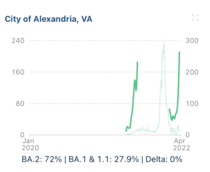
Just look at this! These charts show the level of virus detected in wastewater samples, grouped by county. The graphs are adjusted in scale to highlight individual county trends. Created by data collected by Biobot, a company inspired by the potential of wastewater epidemiology, it’s also the first company in the world to commercialize data from sewage.
You can see whether the virus is surging in your area, if your local wastewater treatment plant is participating in the program. Mine is. The virus is surging right now. How about you?
5) Ugh crap, @BiobotAnalytics dashboard shows wastewater surging even more since my update yesterday. Bookmark this link — it’s the best database, better than even CDC’s. https://t.co/LiK24Vo3FB pic.twitter.com/nHfmao0MKA
— Eric Feigl-Ding (@DrEricDing) April 8, 2022
